
 Is it easy for people to give you the information you need?
Do you have submission forms on your website? Chances are you do. And if your website is an integral part of a thriving organization (and no doubt it is!), chances also are good that those forms enable or support some pretty important functions. They may capture information about your members or donors, get email addresses you need to communicate with people, or even collect money – membership dues, donations, payment for products.
So how well are those forms working for you? If your organization is an association or non-profit, or even a small business, there’s a good chance you don’t really know. You might have the first-generation iteration of these forms on your website, so you don’t have an earlier form to compare them against. Your website analytics should be able to provide good information about how they’re performing, but only if you’ve configured your analytics properly – and, let’s be honest, only if you’re looking at your analytics and you know what to look for.
The value of analytics in identifying website problems
I do feel compelled to say that this analytics piece is incredibly important. I’m going to give you some tips here about things you can do to make your forms better, but all of my advice is based on best practices and what typically works. And you know the adage; there’s an exception to every rule. You really should look through your website traffic reports to get all the information you can about your pages that have submission forms, and you should make sure you understand what you’re looking at and looking for. Otherwise, you won’t be able to know for sure whether any change you make has actually helped. Also, if you need to get interdepartmental buy-in for any changes to the forms, it will help you to be armed in advance with data to show there’s room for improvement.
But having said that, we’ll save in-depth discussion of the analytics piece for another day. Let’s focus here on some best practices for form design and ways in which you might be able to score easy wins with these important pages.
There are several general areas you can look at if you want to make sure your submission forms are optimized for best performance. These include the general structure of the forms (how many pages, etc.), the way they are designed and laid out on the page, and how they render on different devices.
Optimizing the structure of your website forms
One of the most important best-practices when building forms for your website is to use the minimum number of pages necessary. Every time your visitor has to click to another page, there is a good chance you will lose some people. Here are some areas to look at to make sure your form is structured to maximize submissions (conversions):
- Keep the number of form fields to the bare minimum necessary to achieve the primary goal of your form. If you don’t absolutely need a person’s address, don’t ask for it. If you can sign the person up for email with only an email address, don’t ask for anything else on the sign-up page. You can capture more information later – by presenting a different offer, for example, or even by asking for additional information on the thank-you page after your form is submitted.
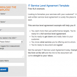 If your form is very short, embed it in your landing page rather than putting it on a page of its own. Depending on the layout of your landing page, and how much is going on there, you might be able to fit 5-7 fields onto an embedded form. Fewer fields is better. Click on the thumbnail image shown here at the right to see an example of this.
- Embed 1-2 critical fields on the landing page, even if you can’t fit the whole form there. If your goal is to sign someone up for email, collect the email address on the landing page. Even if you want to require additional fields for signup, people will be more committed to the process once they’ve actually taken the step of submitting that email address to you on the first screen.
- Make your form dynamic. Rather than showing all the fields at once, are there some that could be added dynamically to the form when an earlier field is filled out? For example, if you need to collect both a company name and industry sector, you might show just the “company” field and have “Industry” appear dynamically once “Company” is filled in. Or, if you need someone to create a user account that includes both email and password, ask only for the email address and have the password field appear once email is filled in. In addition to making your form seem less daunting to your website visitor, adding fields dynamically can make it easier to fit your form onto your landing page.
- If your form really does need to display on more than one page, these rules can help you maximize their usability and performance:- Use step indicators so your users know they’re starting a multi-step process and how far along they are in their progress. Here’s a really nice example from the Villanova University website. The form is embedded into the landing page, but still has a nice “1 of 3” step indicator.
 – Ask for the most critical information up front, and be sure to save the data submitted at each step in the process, rather than waiting until the end of the process. That way, if someone doesn’t complete the form, you’ve at least captured some information.- Don’t forget to keep your form length to a minimum. The fact that you need more than one page for a form doesn’t mean you can let it grow longer than necessary. Keep both the number of fields and the number of pages to a minimum.
Optimizing design elements on submission forms
The layout and design of your form also matters. Both the structure of the page and the individual elements on it can significantly impact usability – and your form’s success.
- Don’t use multiple columns. Time and time again, testing with real users shows that lining up all fields vertically in a single column makes the form easier for your user – which means you will get more submissions. That’s true even though this will make your form longer. (Don’t believe me? Check this out.)
- Use language other than “Submit” on your buttons. Whether or not you believe it, “Submit” almost always loses out when the wording of these buttons is actually tested. Think of something else, preferably wording that connects to the purpose of your form – for example: “Sign Me Up” or “Get the Whitepaper.”
- Don’t ask me why, but flat rectangular and oval call-to-action buttons don’t work as well as buttons with rounded-off corners. Seriously, don’t ask me why, but I have this info on the good authority of Anne Holland of Which Test Won.
- Avoid pale grey buttons. As with rectangular buttons, these almost never win out in tests against buttons with other colors.
- Avoid clutter in or around your forms. This can mean even removing your website navigation from a form. Think about how your user got to the form and whether you really need to give the option to surf around your site at this point. If not, then your website navigation might just be a distraction.
Privacy and security concerns
Privacy and information/data security are very real concerns for people submitting information online. This is true even for younger generations. Don’t believe it? A recent report by the Pew Research Center found that “Young people and those with more online experience are also more likely to resort to lying in order to protect their personal information.” So you need to reassure the people who are giving you their information:
- If you have an ecommerce site, use a Verisign or other icon to assure your users that your site is verified as secure.
- When you ask for an email address, include language that assures your users you won’t spam them or share that address with anyone. (Of course, it should go without saying that you have to honor this promise.) Put this language right by the form field where you ask for the email; just having the privacy link in your website footer is not good enough.
Optimize for mobile users
Mobile optimization of forms can be important as well. To find out how much it should concern you, look to your website traffic reports. (Here’s how, if you use Google Analytics.) If you have a large percentage of users coming to your website on mobile devices, then you need to check how your forms display and function on all of those devices in order to ensure that this growing segment of your audience can use them. For sites with a lot of mobile traffic, here are some important considerations:
- If you have a landing page with information and a submission form displayed side by side, can your mobile users see the form? If your text is on the left side of the page and your submission form on the right, mobile users – especially those on small-screen devices like smartphones, might only see the text. You might need to move the form to the left side of the page – at least on your mobile template.
- For the same reason, if you stack the information on the page vertically, you might want to look at putting the form on top – at least on the mobile version. A mobile user who sees the text at the top of the page might never realize there’s a submission form below.
- If you use website overlays to display submission forms – for example, if you have a site on which an email signup form pops up as an overlay covering the page content behind it, be sure to test how these overlays display and function on mobile devices. They often don’t work at all well, and your mobile version might need to leave off the overlay.
Test if you can
Remember the caveat that I gave earlier in this post, when I said everything I would suggest would be based on best practices and general rules? If you have any ability to test the changes you make to your forms, you absolutely should do that. Not all audiences are the same. And even if something works 99% of the time, your website could be in the 1% minority. So you really need to measure the performance of your forms and see if the changes you make really improve performance.
The best way to do this is to conduct scientific testing – generally called A/B testing (if you are testing only one variation) or multivariate testing. There are great resources available to help with this if you’re ready to do it. Here are a couple of resource lists to start you off:
But even if you’re not ready to do full-blown A/B or multivariate testing, you should be watching your changes very closely through your website traffic analytics. Be sure to benchmark how your form performs before you make any changes and check back after ward to see what effect the changes had.
And be careful not to roll out changes during important seasonal events – right before or during your annual conference, for example, or even during the holiday shopping season. These events can have their own (sometime surprising) impact on website traffic and behavior, so they can skew your traffic patterns and analysis.