

This is my husband (the one with the iPad and no spots). He’s probably shopping.
Are you still struggling to make your website mobile-friendly? There’s a new research study out that underscores just how important this is.
You should be able to see your mobile site traffic in your traffic reports. (Here’s how to find mobile traffic reports in Google Analytics. If you can’t find this data easily in your reporting interface, it’s time to switch to a new analytics package.)
If you’re looking at your traffic reports and don’t see a lot of mobile users, you might be inclined to think that you don’t need to worry about mobile. Actually, the opposite probably is true. Almost 30% of all website traffic comes from mobile devices, up 73% from 2012, according to the Walker Sands Quarterly Mobile Traffic Report. If you’re not seeing mobile traffic to your website, it’s very likely because your site is so unfriendly to mobile users that you’ve driven them away. (Not convinced? Survey your audience. Ask them if they use smartphones and tablets to access the web. I’ll bet dollars to donuts the answer is yes.)
It’s not just about traffic. It’s about conversions.
But there’s an even more compelling reason to mobile-optimize your website – because it’s not just about whether people visit your site on mobile devices. It’s about what they’re doing when they’re there – or what they’d be willing to do, if your website would just let them!
That’s the take-away from the new report I mentioned. Nearly one-third of all website conversions looked at across four industries happened on a mobile device, according to the study, done by AOL and the University of Virginia. A conversion is basically whatever action the marketing team behind your website is hoping visitors will take. In your online store, it’s a purchase. On your email signup form, it’s someone signing up to receive your email. If you’re a membership organization, payment of membership dues is a conversion. So if people are willing to do that from their mobile device, you want to be sure they’re able to do so, right?
That’s why you really, really, really need to take a hard look at what your website looks like on mobile devices. And don’t just look at the pages or sections where you’re looking specifically for those conversions. Look at your whole site – because if the rest of your website is telling visitors they don’t want to use it on their mobile devices, they’re going to get driven away before they ever find your mobile-optimized ecommerce store or membership dues form.
Still need to take baby steps?
Optimizing your entire website for mobile is a daunting project, of course, if you haven’t already done it. And it really does have to be done; so don’t just shelve the idea because it’s too much to tackle. You really do have to get on it. But…
There are some smaller pieces you might be able to bite off and work on in the meantime. Here are a few:
- Those pages where you actually are looking for conversions really are the most important. Even if your other website pages are turning away mobile visitors, you can still use email and other marketing tools to send visitors directly to your store or dues payment site. So start by making sure those pages themselves display well and work properly on mobile devices. And don’t just test them on your own phone; test on iPhone, Android phone, iPad and iPad mini to begin with. If your user/member surveys or website traffic reports show other devices that are common among your audience, add those to the list.
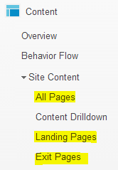 Work on your most popular landing pages. A landing page is where someone enters your website. You might think that’s your home page, but your traffic reports will very likely tell you otherwise. You probably have some visitors coming first to your home page, but others going to pages all over your site. Identify the most common entry points, and make sure those work well on mobile devices. That way, at least the first page people see will give them a good impression; if a later one doesn’t display well on their mobile device, they’ll at least know your site is hit-or-miss for mobile, rather than a #totalfail.
- Same goes for your your most popular pages. These are the pages that get viewed most often, whether or not they are the entry point for your website. Get those cleaned up for mobile devices so they also can help you make a good impression.
- Now look at your site’s most common exit pages. Pretty much the opposite of landing pages, these are the pages from which people leave your site. Don’t assume that every one of these pages is a problem. No one stays on a site forever, so inevitably there will be exit pages. In many cases, people have finished their business with you – found what they were looking for, completed a task, etc. But not always. Sometimes a bad experience will drive people away. So take a look at each of your top exit pages to see how they display on mobile, and clean up any that don’t look good. You want to make sure the mobile presentation of the page isn’t causing people to quit your site.
- Also look at any page that you are sending people to from your marketing messages. If your marketing email asks people to go to a page, check that page out on mobile devices to make sure it renders well. Email is one of the most common tasks people perform on their mobile devices; you want to make sure the people who are most engaged with you – those who receive and click on your emails – aren’t going to see a mess on your website when they get there.
So now you have some starting points, and perhaps a big project to get your entire site optimized for mobile. But the payoff could be enormous. It’s really just too risky not to get it done.