
 Putting together the code for an HTML email isn’t by any stretch of the imagination the same as coding a web page. Email has special constraints and special issues. The way you code it can affect everything from how it displays to recipients, to whether it gets into their inbox at all or gets flagged as possible spam.
Things are even more complicated than they used to be – and better, really, for email marketers – because it’s now possible to code emails to display one way for people who open them on a desktop/laptop and another for those who open on a mobile device. With more and more people using smartphones to access email on the go, it’s critical to make sure your emails display well on these devices.
Here are a few basic tips that will help you build better email:
Never rely on images. Many email systems block images as a default display setting. So if you use images to display important messages in your email, chances are a lot of your recipients will never see your message. What can you do?
- When you use images, don’t incorporate your text message into them – no matter how much you like the way it looks. Use HTML to display all of your text.
- If you have a header image on your email, display text above it. Make sure this text does two things: (1) Includes your main call-to-action message. (2) Includes a link to “view with images” or “view this email online” so the recipient can link to an online version that shows all images.
- Use alt tags with images, so recipients can see at least a description of any image that doesn’t display.
Use inline styles only. External style sheets are not supported by many email clients, and even internal embedded style sheets yield inconsistent results. If you aren’t sure exactly what inline styling is and how it differs from other CSS methods, here’s a really good explanation.
Avoid Flash and javascript. They just really won’t work in email. Sorry.
No embedded video. You can link to a video online, either with a text link or a still image (see advice on images above). Or you can use an animated gif, which works in most cases and will give you the animation/movement that you might be looking for to attract your reader’s attention. (Here’s a good article on animated gif support in email.)
Optimize for mobile. This can be very complicated, but a few basic rules will give you a good start: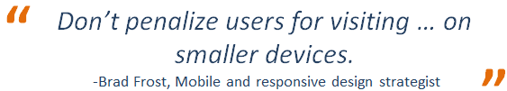
- Keep your email width to 640 pixels or smaller.
- Make sure your header image, if you have to have one, is as short as possible. On a mobile device, what looks like a modestly sized header on your computer can push most of your email content off the screen.
- Make your links easy to click for someone who has clumsy fingers. (That’s me.) Increase the text size and padding around them. When possible, use button links for mobile, rather than just text. And make sure the buttons you use aren’t too small to tap on without making the recipient zoom in on the screen.
- Go with a single-column email design if possible.
- Use responsive design to customize the display for your mobile recipients. Your email doesn’t have to look the same to a smartphone user as it does to someone opening it on the desktop. See the resources below for specific information on using responsive design in emails.
- Test how your email renders on the mobile devices most commonly used by your audience.
Ready to dig into the code? Below are some in-depth resources that can help.
General Email Coding Resources:
Guide to CSS Support for HTML Email
Email Design and Coding Recommendations
Coding Pixel Perfect Emails
Responsive and Mobile Email Design Resources:
Responsive Email Design Guide
Mobile Email Guide