I’m going to the theater next weekend. It’s kind of a miracle that I was able to buy tickets.
There’s no ticket scarcity that I know of. It’s not “Hamilton” I’m seeing but a very small show presenting a series of 5-minute plays focusing on themes related to digital privacy; it’s part of a series of local productions sponsored worldwide by the nonprofit Goethe Institut.
What makes it amazing that I’m able to attend is the website usability fail I had to get past in order to buy tickets. It was one of the worst digital user experiences I’ve had in a long time — and it turned out to be caused by one simple error.
Here’s how it went:
When a promotion for this event caught my eye on Facebook, I clicked through to read the details in the event listing. Intrigued and wanting to attend if the price was right, I clicked the link to find tickets:
![]() So far, so good.
So far, so good.
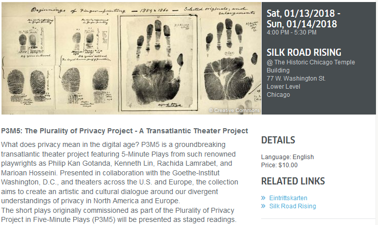
The landing page for this link gave me the pricing information I wanted — $10 tickets, perfectly reasonable, within my budget. That was all I needed to convince me to attend.
That’s when I discovered my challenge. Despite being the landing page for a link that said “Find Tickets,” there was no “tickets” link on the page. Take a look, and believe me when I say that I moused over the image and all the text on the page, and the only links available were the two “Related Links” on the right.
 If you can speak German, you know where this ends. If not, let’s suffice to say that from here, my behavior consisted of the following:
- I went back to Facebook to try again, thinking maybe I missed the real ticket link or somehow clicked in the wrong place. (I think I did this more than once; I was perfectly ready to blame myself.)
- Presented repeatedly with the same landing page, I looked for alternatives. I eventually clicked the “related link” for Silk Road Rising, the local theatre company producing this event, hoping they might offer a working link to get tickets.
- That took me to a page dominated by a call for donations — and by dominated, I mean everything “above the fold” was a call for donations, and the entire next screen scrolling down was a video about…donating. Way down on that page I did find a link to buy tickets for this performance, which led me to another page with its own usability problems; however, because I was unusually committed to finding these tickets, I did eventually make it work.
Wanting to dissect this truly difficult experience, I went back to the original landing page shown above, where eventually I realized that the other “related link” on the page, “Eintrittskarten,” is the German word for “tickets.”
And that’s the small mistake that caused this problem. One key word on the page of this English-language website had not been translated into English. We can discuss all day whether “tickets” should be considered a related link; it shouldn’t. But even placed in that section, it would have been perfectly clear and usable if only it were in English, like the entire rest of the page.
The lesson? Details matter.Get them right, or suffer the consequences. In this case, the consequence likely will be fewer people attending the performances. That’s too bad. The theater company probably could use the funds, and the Goethe Institut probably would like as many people as possible to see what they describe as “a groundbreaking transatlantic theater project.”
I’m hopeful that it will be worth the trouble it took me to get my tickets.