
I’m a fitness tracker. Exercise, weight, the foods I eat, how much water I drink… I track it all. It helps motivate me to get healthier.
The other day, I walked my dog to the library so I could return a book. It’s a moderate-length walk for us, a couple of miles, and was uneventful save for the fact that my phone crashed while I was using it to track my exercise. So when I got home, I had to log the walk manually. My phone still didn’t want to behave, so I fired up my laptop to use the tracking app’s web interface. What greeted me was an object lesson in usability:
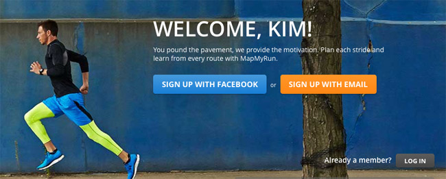
Do you see the problem? Look closely.
Can you tell whether I’m logged in?
The answer is: you might think you can, but you really can’t—because the website is sending mixed signals. On the one hand, it knows who I am: “Welcome, Kim!” (Oh, that’s so nice; you must be my friend! You know me, and you use my first name.)
But if you know me, why are you asking me to sign up? What am I supposed to do here? I’m already signed up.
Oh, I see: Buried there in the lower right corner is a “log in” button. I guess I’ll try that—although I don’t understand why I have to, since you clearly know who I am already.
Usability fail.
UX matters: It has to be about the user
OK, before you all start chiming in with technical explanations of how this happened, that’s not the point. The website didn’t recognize me, probably because my cookies from my last session had expired. But some or all elements of the on-screen display probably pulled up from my browser’s cache, including the personalized “Welcome, Kim!” message.
Despite the welcome message, I really did need to log in.
[tweetthis]It’s all about the user. It has to be. #Usability[/tweetthis]The point is, though, that this is a miserable user experience. Recognize me or don’t recognize me, but don’t send me mixed signals. Give me a clear indication of what’s going on and what I need to do to use the website. If it’s hard to figure out how to override the cache and force the right elements to display, … figure it out anyway. That’s your job.
I might sound unnecessarily harsh. But this is really important. As a website business owner, it’s your job to make the experience easy and enjoyable for your user. If you don’t, they’ll stop coming.
So if you’re having trouble implementing advanced functionality well, you have two choices:
- Figure out how to get it right.
- Scrap it and do something else.
No matter how hard something is to implement, technical difficulty is never an excuse for a bad user experience.
Because it’s all about the user. It has to be.